Typography
Illustration
When Every Word Becomes the Art
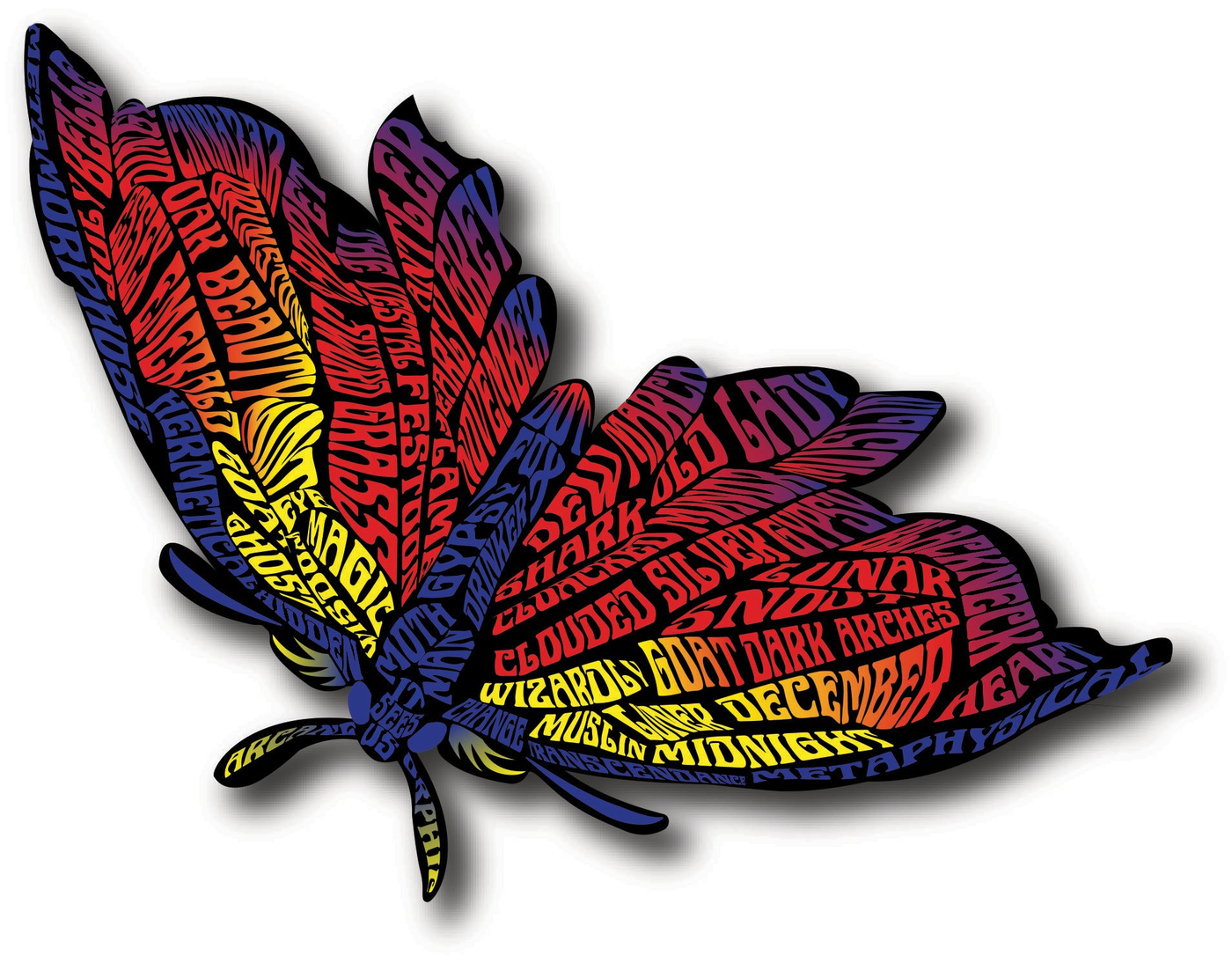
The Moth — Fire Series
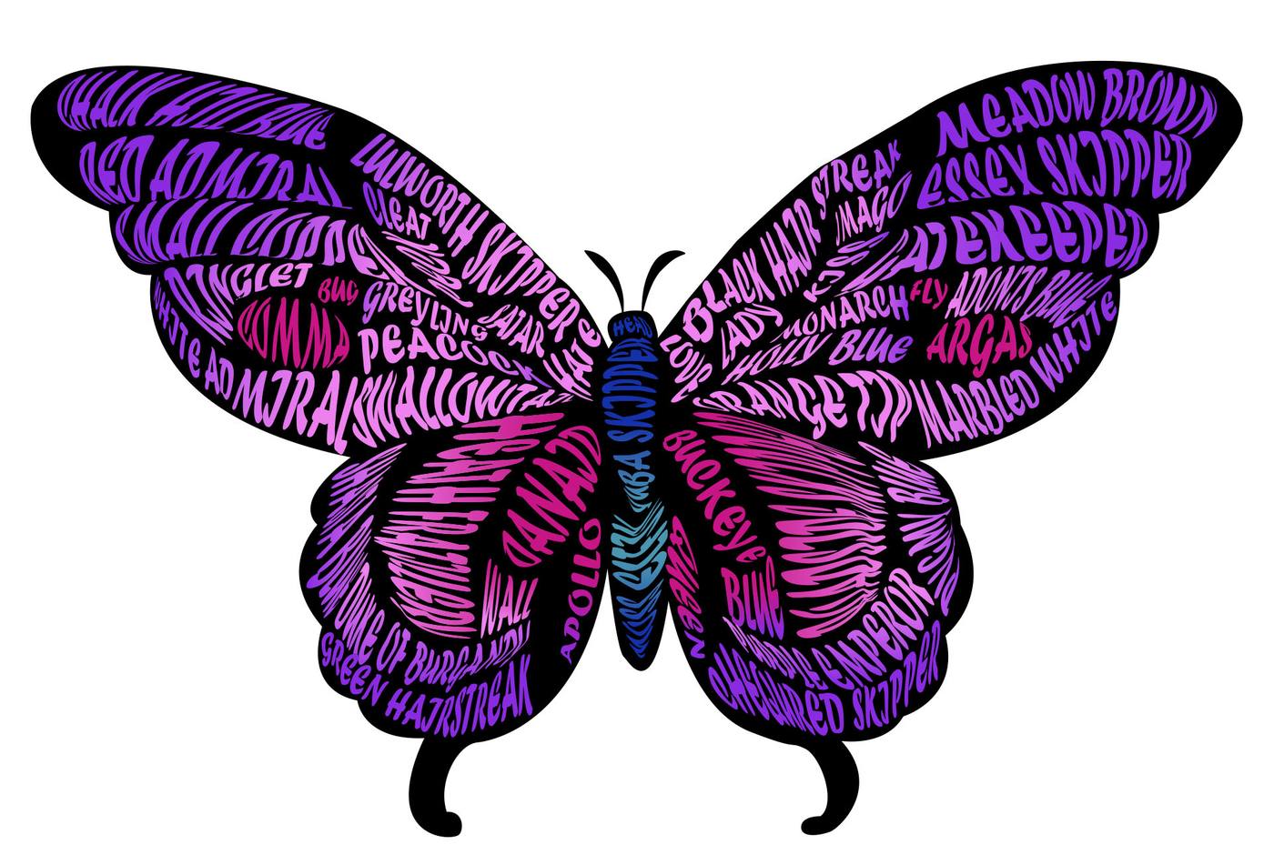
The Butterfly — Species Series
When Every Word Becomes the Art
Typography illustration is one of the most technically demanding disciplines in design. Every element of the form — every wing vein, every body segment, every shadow — is built entirely from words and letterforms. No outlines filled with color. No shapes with text overlaid. The type IS the illustration.
Two pieces. Two completely different palettes, moods, and word sets. Both demonstrating the same rare skill at the highest level.
The moth form is built from moth-related words, folklore terms, and poetic descriptors — each one chosen to reinforce the mystical, nocturnal energy of the subject. The gradient moves from deep purple and blue at the wings' edges through red, orange, and into yellow at the body — mimicking firelight, the moth's eternal obsession.
The diagonal composition gives the piece energy and movement — this moth isn't pinned to a board, it's mid-flight.
The butterfly piece takes a different approach — the words are all real butterfly species names, turning the illustration into a living field guide. The symmetrical wingspan composition creates balance and formality, like a natural history illustration — but rendered in neon pink, vivid purple, and electric blue.
The body of the butterfly runs in contrasting teal/blue, creating a visual spine that anchors the entire composition and gives the eye a path to follow.
Most people look at these pieces and can't figure out how they're made. Here's the breakdown.
Together these pieces demonstrate range within the same discipline — different subjects, different palettes, different word sets, same extraordinary level of craft.