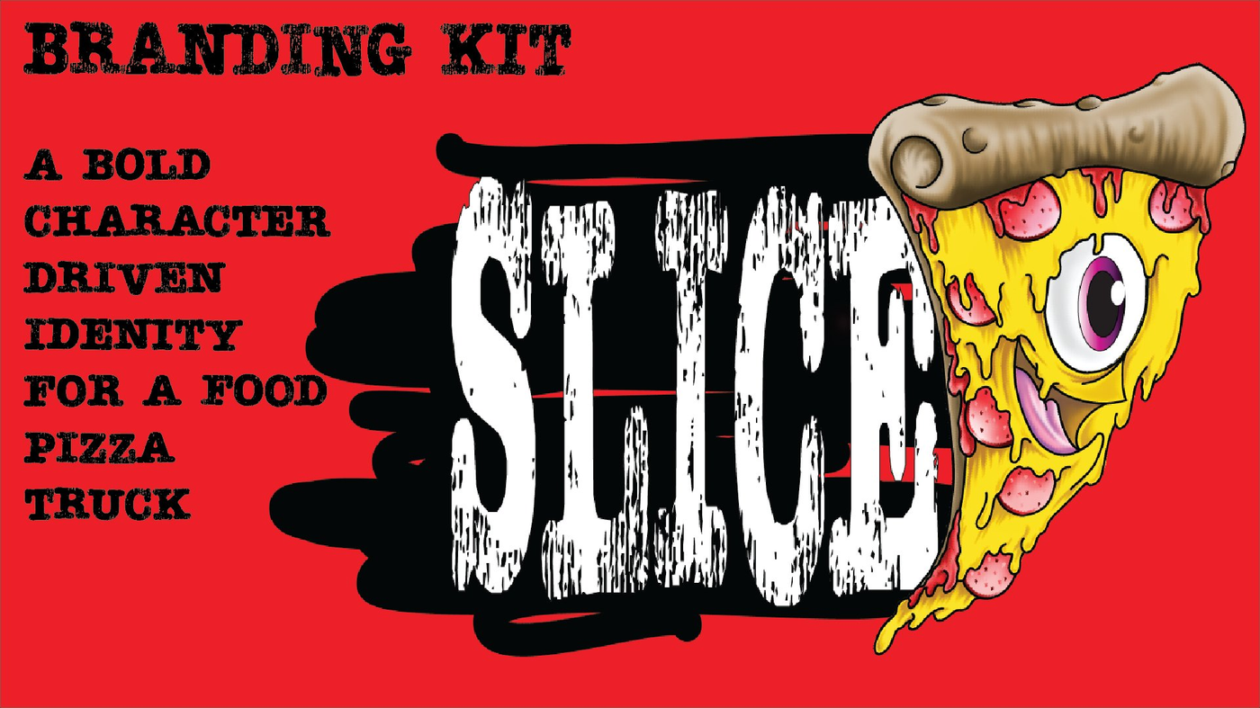
SLICEPizza Co.
Slice is a high-energy food truck serving oversized, attitude-filled slices of pizza. The brand needed to stand out in a crowded street-food scene with a visual identity that felt like a character itself — loud, gritty, and instantly recognizable.
The challenge: build a complete brand system from scratch — mascot, logo suite, color palette, typography, truck graphics, packaging, and merch — all unified around one unforgettable personality.
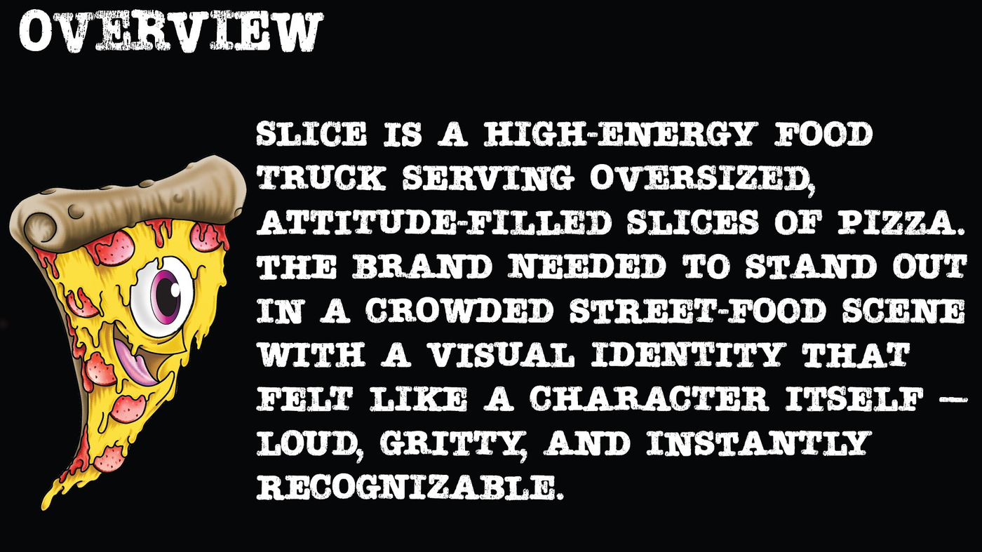
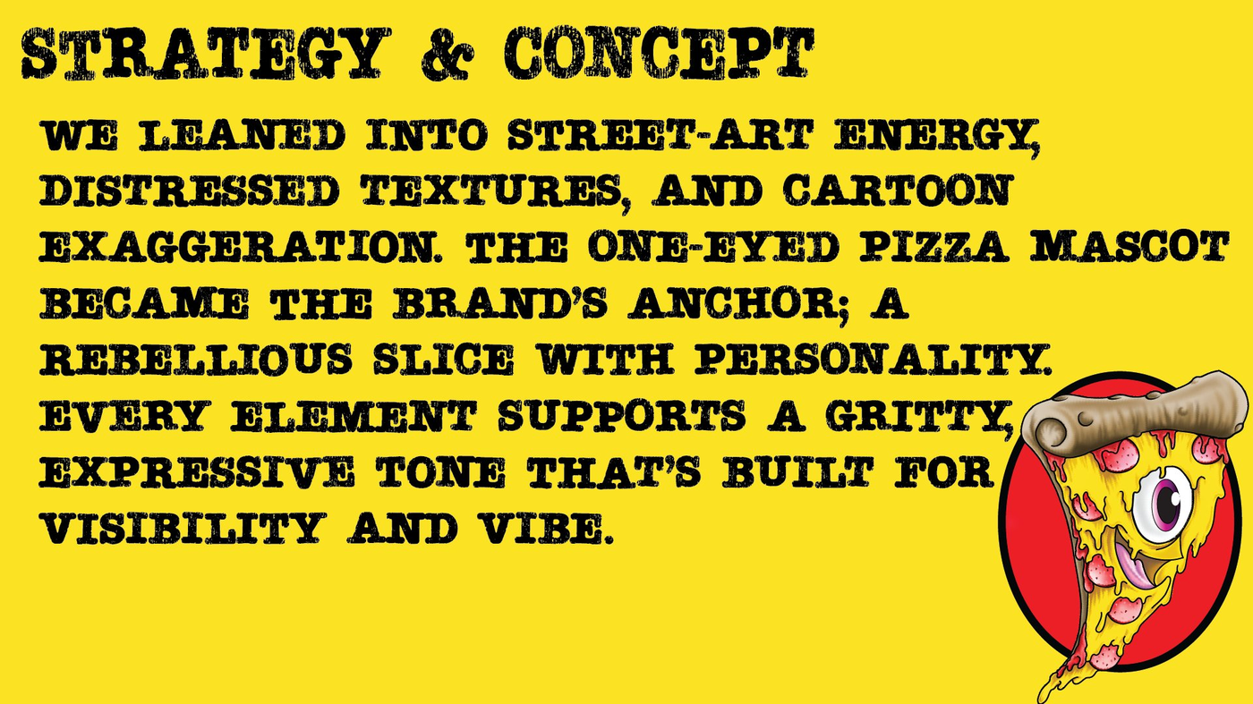
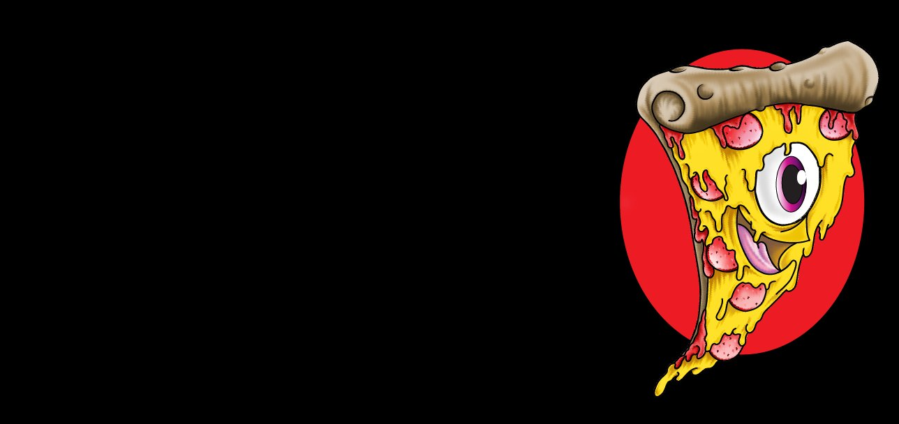
We leaned into distressed textures, street-art energy, and cartoon exaggeration. The one-eyed pizza mascot became the brand's anchor — a rebellious slice with personality that could live on a truck, a t-shirt, a pizza box, or a sign and immediately communicate the brand's attitude.
Every element supports a gritty, expressive tone built for visibility and vibe. This isn't a pizza brand — it's a character. And characters sell.
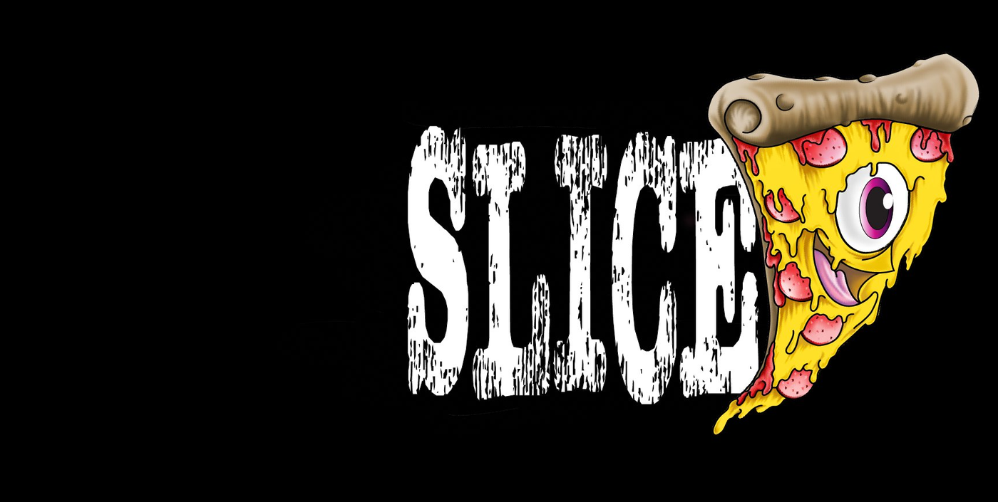
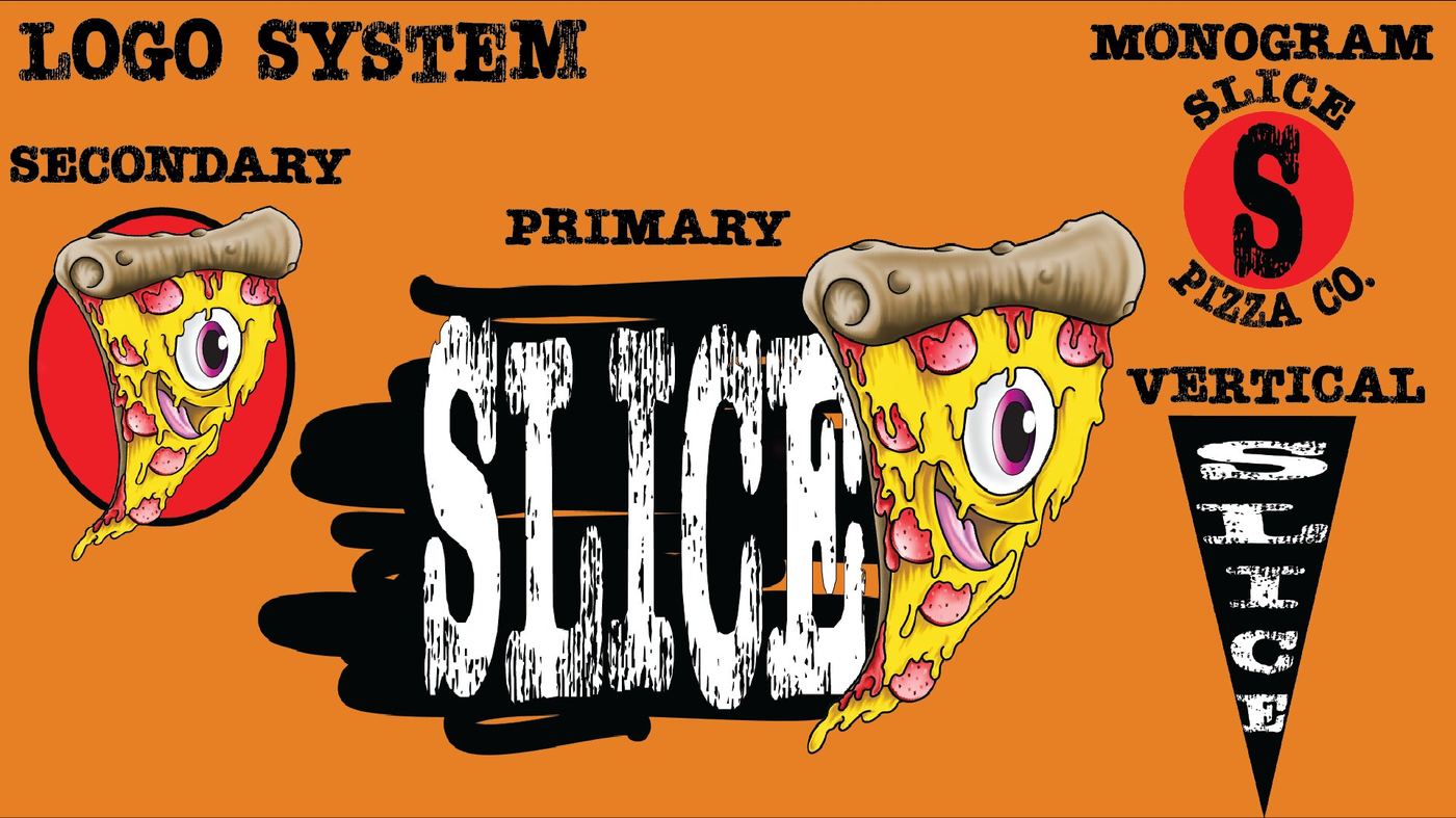
A complete logo suite with four distinct marks — primary wordmark, secondary character badge, monogram, and vertical lockup — so the brand works at every scale and application without losing impact.
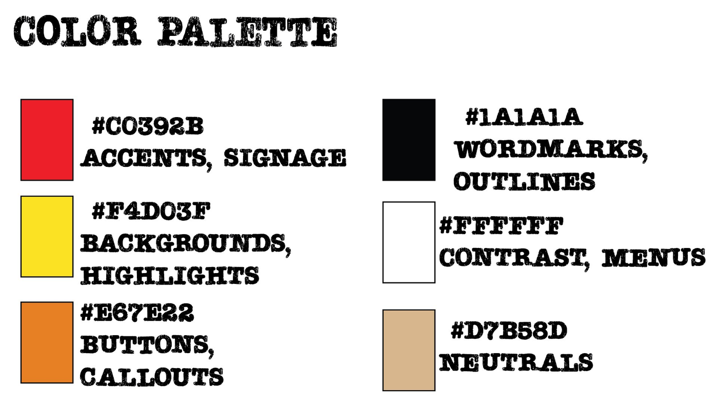
A deliberately loud palette built around street food energy. Every color has a job. Red for signage and attitude. Yellow for warmth and hunger. Orange for callouts. Black for the grit. White for contrast. Tan for neutrals that don't compete.
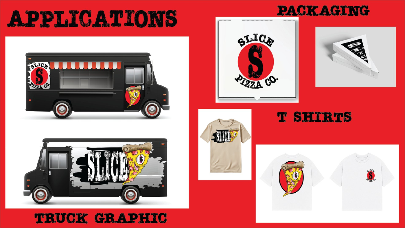
A brand doesn't live on a mood board — it lives in the world. The Slice identity was applied across vehicle graphics, packaging, and apparel to prove the system works at every touchpoint. The mascot holds its own on a 20-foot truck wrap and a 3-inch pizza box stamp.
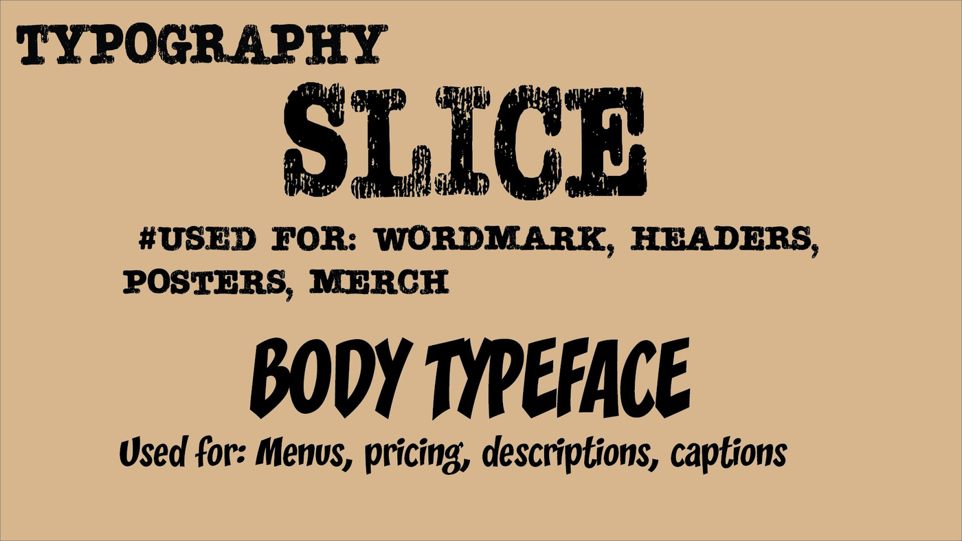
Two typefaces — a distressed display font for wordmarks, headers, posters, and merch, paired with an expressive bold body face for menus, pricing, and descriptions. Every piece of type communicates the brand's gritty personality.
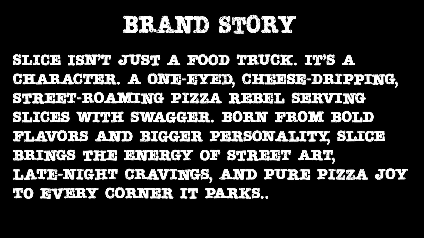
Slice brings the energy of street art, late-night cravings, and pure pizza joy to every corner it parks. The brand story isn't told in a tagline — it's baked into every visual element. The character IS the brand. That's what makes it stick.