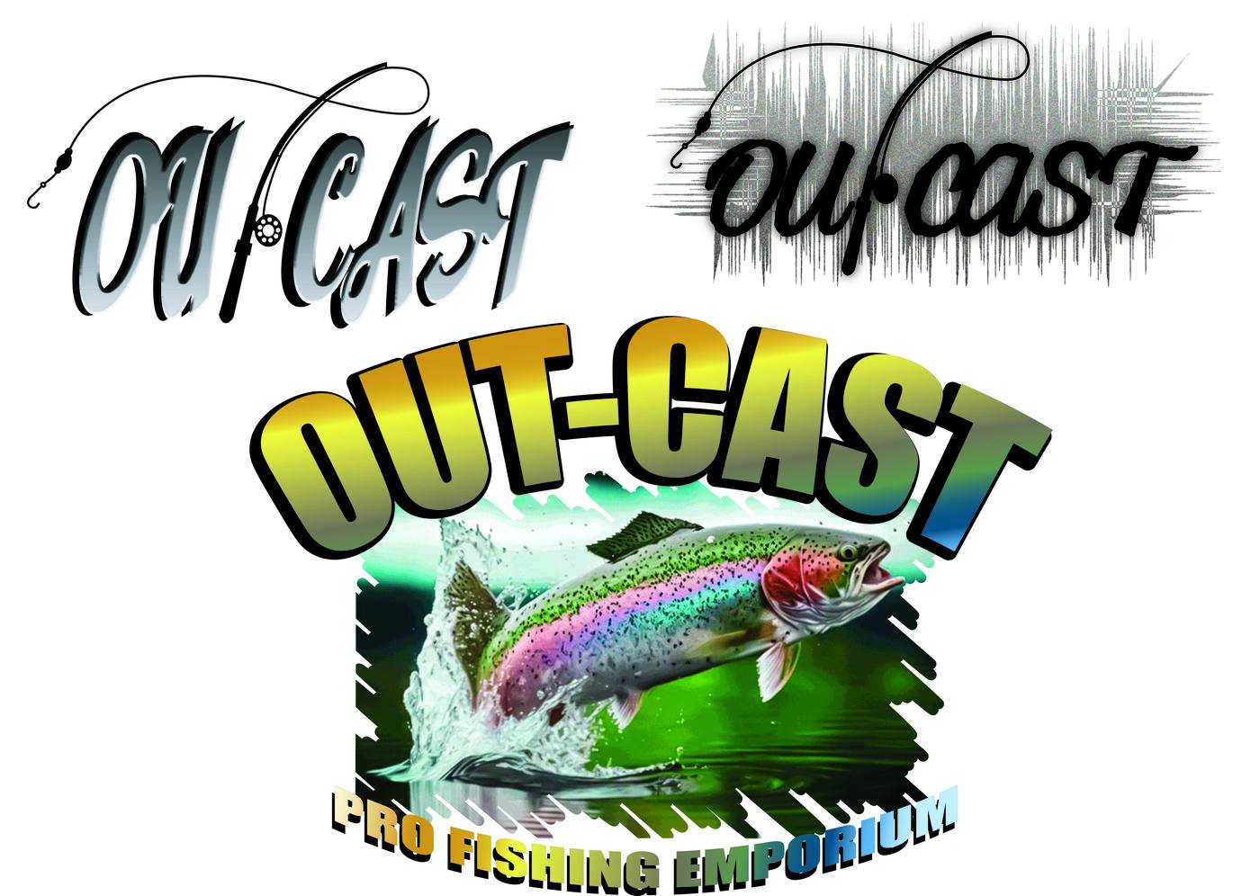
OUT-CASTPro Fishing Emporium
Out of This World Fishing
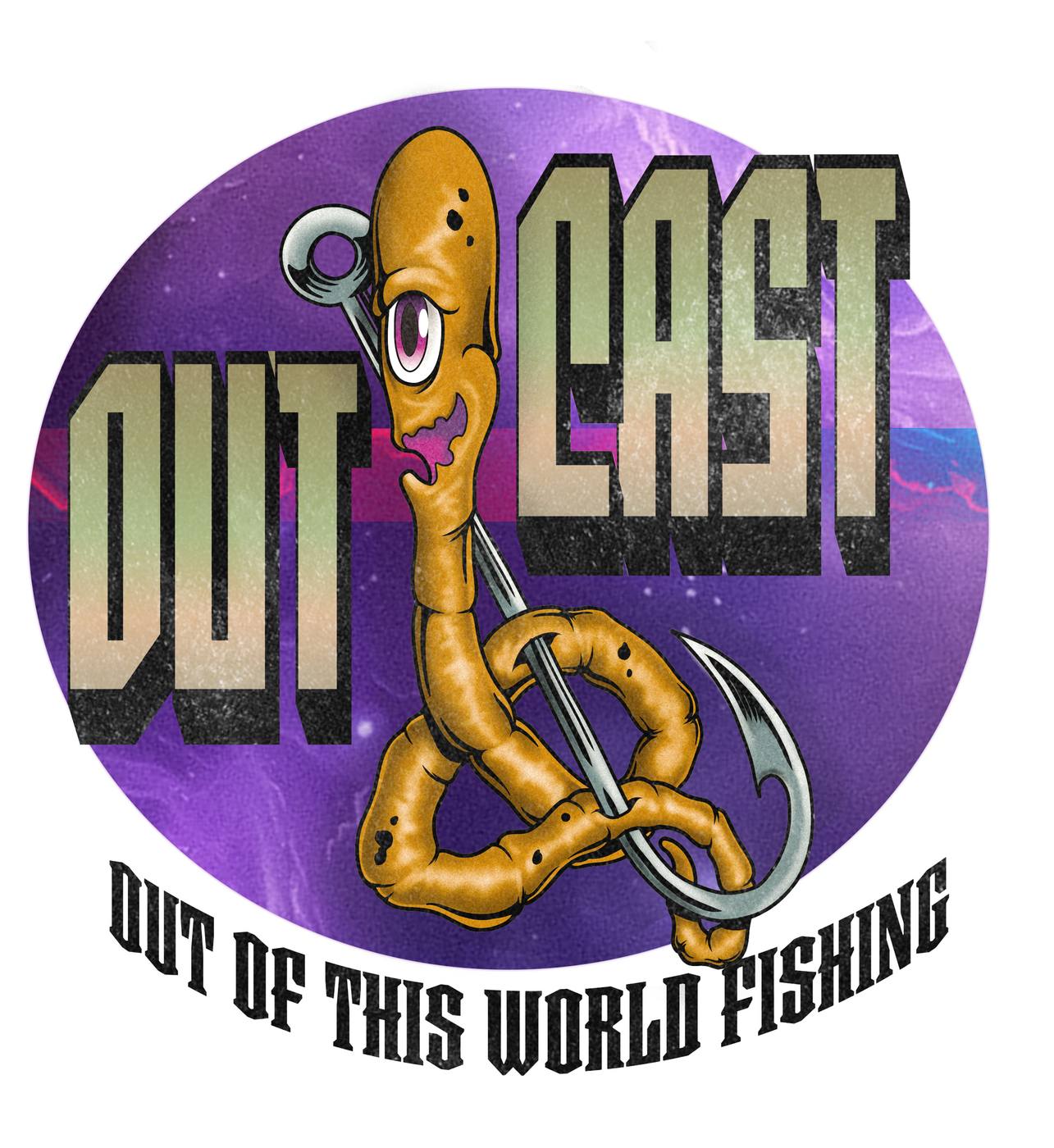
Out-Cast needed an identity as wild as the fish stories their customers tell. A pro fishing emporium that wanted to stand apart from the sea of generic tackle shop brands — with a look that was bold, memorable, and had genuine personality.
The brief: build a brand system with multiple logo variations — from a character-driven mascot mark to clean script wordmarks and a full illustrated emblem — that could flex across signage, merch, and digital without losing its identity.
The centerpiece of the Out-Cast brand is a one-eyed worm character — coiled around a treble hook with a smirk that says it knows something you don't. Equal parts creepy and charming. The kind of mascot that ends up on a sticker on every tackle box in the shop.
A complete logo suite giving Out-Cast the flexibility to show up differently across every touchpoint — from a hand-crafted script wordmark to a bold illustrated emblem with a jumping rainbow trout. Every mark is rooted in the same brand DNA.
The Out-Cast system demonstrates the ability to work across three distinct visual registers within a single brand — from hand-lettered elegance to bold illustrated power.